Tommy Ruff is a celebration of family, passion and love of seafood.
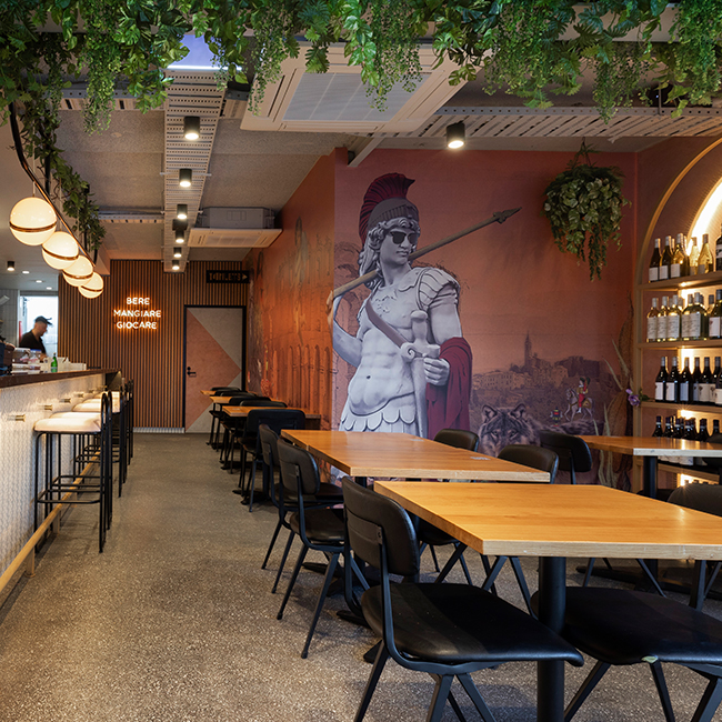
The design re-invents the Fish & Chips stereotype to a contemporary experiential brand, offering quirky, colourful interiors with a sprinkle of cool, tattoo styled graphics inspired by old sailor stories and styled nautical features.
The real strength of the space is the cohesive approach to the overall brand, spatial integration & attention to detail. The concept is consistently adjusted and considered to ensure that the Tommy Ruff message is always present. From the Hipster Captain mural, the branded beers showing Krakens, Mermaids & Pirates to the custom fishing rod lighting features. The attention to detail which is delivered so successfully is crucial to the Tommy Ruff magic.
When owner of the award winning South Melbourne icon "Clarendons Fish & Chippers" decided to open the first fish n' chips shop in the Elsternwick area he approached Studio Equator to design the new brand and fit out for his business, and we're so glad he did! (as we have designed 3 for them so far: Elsternwick, Windsor & Mordialloc). After 30 years in the business, John's passion for fresh seafood is still strong and inspiring, and doubtless one of the reasons he has been so successful. John wanted this passion to show not only in the quality of his food, but also in the branding and fit out of his restaurant.
In creating the new visual identity and brand, we wanted the look to be varied and visually interesting, while still being consistent as a whole. To this end we used several different fonts and layering of patterns, text and illustrations.
We developed different graphic styles - a coloured textural triangle pattern, a fishing net pattern and a fun collage of newspaper clippings featuring owner John Stamoulis who is well known in Melbourne's fishing and seafood communities.
All of these were also overlaid by playful hand-drawn illustrations that were used throughout all the graphic applications, and also applied to our interior design concept.
The collage of newspaper clippings featuring John was made into custom wallpaper and used as a feature wall - a great testament to the heritage of the brand and John’s passion and experience.
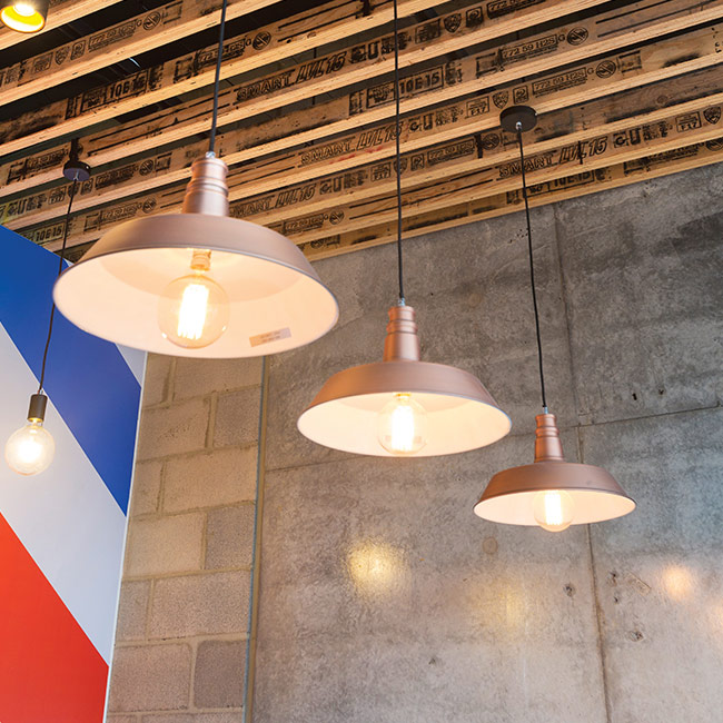
We strung pendant lights across the ceiling to create a look suggestive of fishing nets, and designed custom feature lights from fishing rods for a unique and deliciously relevant detail.
The overall effect is natural, rustic and reminiscent of the ocean and traditional seaside establishments.
Bright beach colours and fishing inspired details are used throughout to give the impression that you are right on the ocean, perhaps about to fish for your own lunch!


