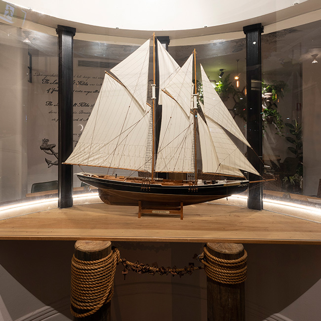
A creative elegance intrigues you to step through the entrance of Salon De Sushi opens arms with its creative elegance for an atypical sushi experience. Situated on Clarendon Street, South Melbourne, Salon De Sushi believed that their concept was one that must be translated through the eyes of Studio Equator’s designers.
Victoria and Australia wide are littered with Sushi bars, the owners of Salon De Sushi wanted to refresh the ‘sushi bar’ concept through it’s interior design and visual identity. The owners wanted to be more classic and original in their concept but keep a strong identity that would potentially carry to an iconic chain of ‘salons’, duplicate the interior image, logo and identity and become instantly recognizable to sushi lovers of sort.
Their interpretation of quality outlined with simplicity and trust, this is shown throughout the materials used, the finishes of the designs and their touch of French inspired features. Elegant wood paneling with the traditional French architrave frame the display fridge, giving that touch of dark elegance whilst still highlighting the product in the display. The floor is tiled with intricate and coloured patterned tiles that give off a hint of Mediterranean feel.
Each table is then structural fixed to the walls with the feature floor tiles crawling up the walls and across the ceiling creating a distinctive box shape dining table reflecting the polished boxed packaging concept in life size form. Its been designed as one unit. Sushi is bought in a box and displayed in a box, so they mimicked the realism of eating inside your sushi box.
Adjacent to the wood paneled walls of the display, hand painted wall graphics creep behind the tiles like origami. The graphics are shaped and geometrically manipulated to show a pixilated impression of a Japanese landscape, with shades of seductive red, black and grey colours. The geometric pattern of the origami style graphics looks almost pixilated when the intricate lights reflect onto the walls. The shades of red, black, dark brown woods, gold trimmings and Mediterranean tiles create the precise amount of quality the owners where hoping to portray in their French inspired interior.
Industrial Tom Dickson lights fill the room giving sporadic shaped reflection, also replicating an origami design, clustered above each table.
Once you reach the end of the space, a wooden box fit out with beautiful timber walls, floors and cieilings holds a space for communal dining. Inside this elegant dolls house lies a black custom designed communal table. This is another version of Studio Equator’s famous “Frankenstein Table” where they have mixed and matched tables and materials and physically fixed 3-4 tables into one. Japanese illustrations create a bespoke wallpaper. This creative concept has has extended to the A3 Japanese graphics and Manga characters in the restrooms, where Studio Equator has taken these papers and carefully pasted them onsite to create this effect.
Marbel benchtops, custom made and designed wallpaper
Bear life size made out of MDF installation. Why not?! One of the strongest refrences for the Salon De Sushi brand. Shop regonistion to stand out in the street. Very common in Japan to have a giant installation whether it’s an animal or icon, in a shopfront. Iconic to the salon de sushi label.
LOGO – based on a famous French pattern. It’s a flower called feur de lis. This was a symbol of the King in French. So we made a Origam-ic version of the Fleur de Lis.
V.I – based on the same design brief – business cards, packaging, stationary, Logo and signage. Japanses graphics on the wallpaper wooden box room all taken into the collateral for the identity. Ancient Japanese illustrations.


