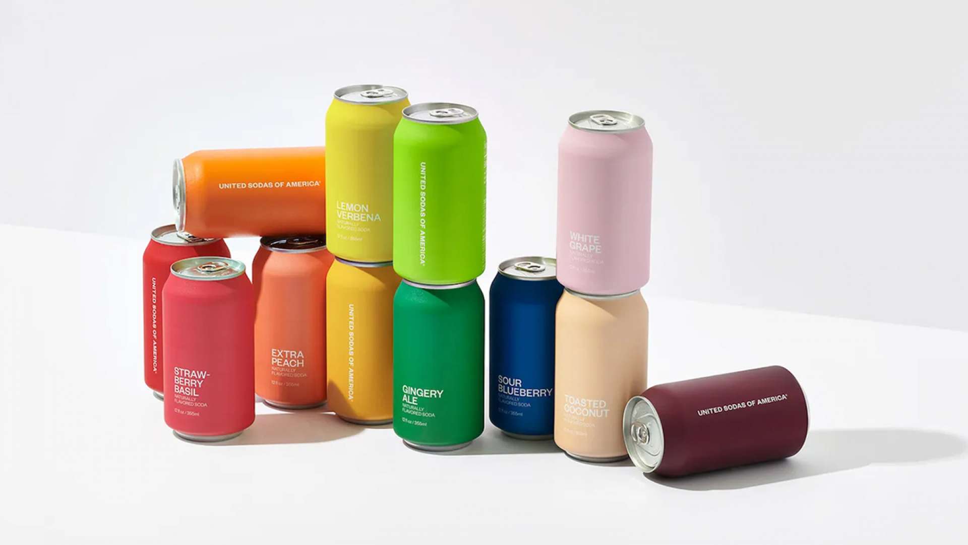
THE UNITED SODAS OF AMERICA VISUAL IDENTITY REPRESENTS DIVERSITY
The visual identity for The United Sodas of America is a minimalist yet ultimately democratic design. Conceived by a Brooklyn-based studio Center, it was inspired by America’s diversity and complexity.
Following the belief that variety sparks unity, the designers imagined a palette of 12 bold, solid colors complemented with a versatile sans-serif font. Each taste is strongly reflected with the right shade – from Young Mango to Blackberry Jam. This approach to branding reflects on how political can drive aesthetics in the quest for a better world.
VIA: https://trendland.com/the-united-sodas-of-america-visual-represents-diversity/
Blog ◦
22 July 2024
Get in touch
We would love to have a chat about any ideas you have for your business. Why not call Carlos to make an appointment and see where we make things happen? Contact Us


Related Blogs
-

LA Architects and Designers Build Imaginative Outdoor Cat Dwellings for Charity
Blog ○ 03 December 2017 -
Cabrón Madrid
Blog ○ 06 July 2024 -

Beautiful & Interesting work by Artist Hamed Maiye
Blog ○ 08 August 2021